When thinking about renovating a rental property, it is important to establish a color scheme or palette to use as a guide when making your design selections. This will allow your home to look cohesive, professional, and overall extremely clean and attractive for advertising.
Your tenants will also love it when they move in! Renters in major cities have TONS of choices these days, it can be easy for a rental property to get lost in the shuffle or overlooked during the quick browsing.
We’ve put together some quick tips to make it easy to select your optimal color scheme:
Making Your Property Stand Out
One of the best ways to showcase the incredible work you put into a renovation is hiring a professional photographer or management company to really portray your property in its best light (both literally and figuratively). Professional marketing does a world of difference when it comes to standing out amongst the competition and grabbing a viewer’s eye when they are scrolling through properties with speed.
Start by doing some research before deciding which design direction you’d like to pursue. Check out properties on Zillow or interior design websites such as Architectural Digest. What are YOU attracted to? What types of spaces catch YOUR eye? Consult with friends or family to gain additional points of view, but as a general rule of thumb, you should always stick with what you personally think looks good.
In order to narrow down the palettes and color scheme that excite you, think about how they may look in your home. If you have a historic home, perhaps hard-edged, modern renovations are not the way to go.
If you have a relatively modern home with simple clean lines, adding a touch of fun with colored tiles or paintings is a great way to add a bit more character and make the new development cozier. Think about design selections that will add to the existing structure of your home and enhance what you have to work with.
Color Palette Pro-Tips
Function is just as crucial to think about, and two dimensional choices can still be functional! Color is one of the best ways to change the mood of a space. Color is also a great tool to use when trying to alter the perception of the room’s size. To make a room feel larger, stick with lighter colors. To make a large space feel more comfortable, try painting the ceiling a darker color.
The color palette you select will apply to paint, tiles, hardware such as faucets and cabinet handles, flooring, and even the exterior of the home if applicable. For renovating a space with the intention to rent, it is important to think of color choices that will be universally appealing to tenants. However, this is still an opportunity for you to be creative! So don’t be scared to have fun with your selections and incorporate your own personal style.
For the remainder of this article, we are going to be discussing interior design and the different color schemes that will work best for your rental property.
Let’s break this down room by room.
Living room
Blacks & Grays:
When in doubt, you cannot go wrong with black, white, and gray tones, and natural wood. This scheme will withstand the test of time, look incredible with all furniture, and always be stylish.
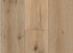
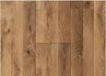

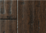
If you decide to use this color scheme, feel free to be a little edgier when it comes to lighting and floor patterns! Creating a herringbone or chevron pattern is a beautiful way to create a conversation piece out of your floors.
Neutral Tones:
Another color palate for your living room that will bode well in the rental market is neutral tones with a subtle hint of warm color. These choices are fantastic if your property has plenty of natural light.

Pro Tip: When sampling paint choices, it is crucial you allow the paint sample on the wall to dry as they may change in tonality once dried.
Think about the texture of the wall itself, if there is a slight roughness try experimenting with different paint types such as mat vs glossy. The texture may effect how the paint color reacts to the natural light.
Take a step back as well! A few great tips from interior design legend, Kelly Wearstler, is to grab a chair and sit in the room for a while, also try examining the color during different times of day before making your final decision.
Lighting
Lighting is also a selection which will be very important for your living room. Adding dimmable lighting is a great way to allow your tenants to enjoy altering the mood of their space.
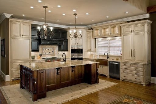
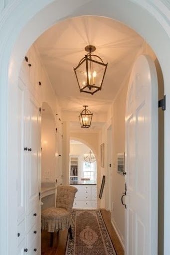
Don’t be shy to add some architectural lighting! Architectural lighting is anything that is attached to your home, such as a sconce, pendant or chandelier. Lighting makes the eye travel and can completely change the perception of the room, so where do you want the attention? If you have a beautiful archway, perhaps adding sconces or a chandelier would be a great way for a viewer’s attention to be brought upward.
Kitchen
Ah the kitchen, the heart of the home. This is an opportunity for you as the designer to really mesh form and function.
If your property has an open kitchen, continue the color scheme of the living room into this space. If the kitchen is somewhat closed off, you have a great opportunity to add a little surprise with some fun colored cabinets or a decorative backslaps.
In order to make a small kitchen appear larger, a few quick tricks are to make shelving open or transparent, using reflective surfaces, choosing slimmer cabinet and a compact fridge. Additionally, smaller spaces benefit from lighter cabinets, but choosing dark cabinets can create a cozier space. Try some of these tips when working with a small kitchen space.
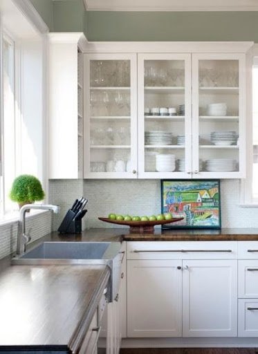
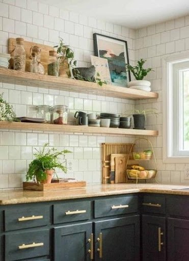
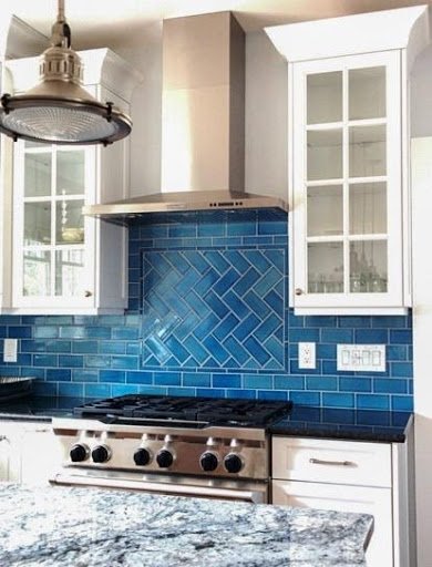
When deciding what color scheme would look best in your kitchen, one tried and true trick to keep your kitchen looking up-to-date is alternating light and dark colors between your cabinets and countertops. So, if you choose darker colors for your cabinets, go with a lighter neutral color for your countertops, and vice versa.
Finally, your kitchens backsplash is a great opportunity for you to add some personality to your kitchen space and add some color. For more information on how to effectively utilize your backsplash (i.e. what materials go together, what colors will accentuate the room, and how to avoid common mistakes) check out this article.
Bedroom
It’s always best to keep this space pretty minimal as the renter will likely add their own artwork, fun furniture pieces, and of course, overall really make it their own.
A bedroom is such a sacred place for us all, so leaving the canvas a little blank in this room is absolutely fine. Staying within a neutral color scheme is recommended for bedrooms. Again, thinking of appealing to all tenants is key!
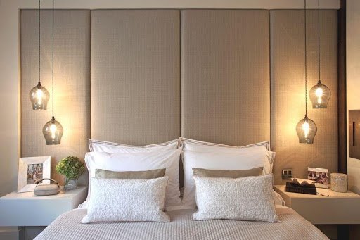
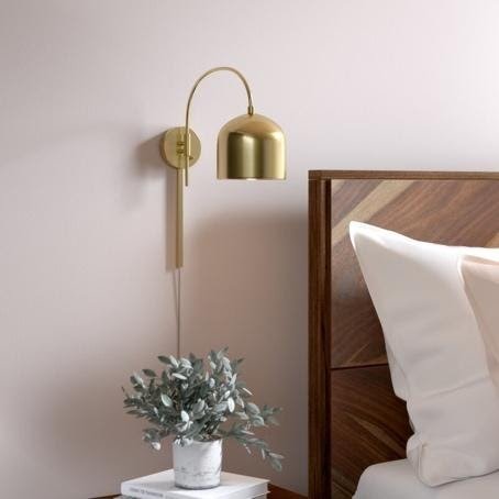
If the bedroom has only one logical place for a bed, a creative design element you can incorporate are hanging pendants or wall mounted sconces. Lighting is informative and you can use your placement to let your tenant know the ideal bed placement. This will also be fantastic for your tenant as you’ve now given them two lighting moods: overhead lights and bedside lights.
Bathroom
The bathroom is an area which should be approached similar to the kitchen. Put yourself in the tenant’s shoes when designing a bathroom for a rental property. Think of storage solutions, counter top space, draws, towel hanging solutions, and shelving within the shower itself.
We all know how frustrating it is to have our 10 bottles of soaps and conditioners that we “NEED,” and not enough shelving to hold them all.
One creative solution to allow for ample shelving space is to add tiered corner shelves. For bathrooms that are going to be en-suite, a great trick to optimize space is to throw in a pocket door.
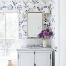
The bathroom is also an area within the house to add some bold touches! A fun wallpaper in a small half bath is a quick way to make the space a little surprise for prospective tenants and their future company.
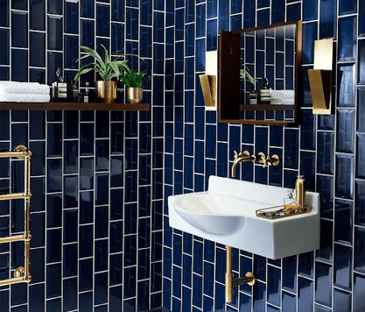
Tiling is also an easy way to incorporate vibrant colors to contrast with clean counter tops and hardware. When making your selections, make sure to view all the samples together. Questions to ask yourself are: how do the textures work together? How are the scales of my tiles working together? When selecting more than one tile option for your bathroom, similar scales will compete against each other. If your shadow tile is going to be traditional subway style, go for larger tile on the ground.
Conclusion: Choosing a Color Scheme for a Rental Property
When making your selections for each room of your property think: cohesion, cohesion, cohesion. One of the best practices you can implement is sampling. Lay your tile sample with your paint swab with your counter sample with your floor sample. How are these samples working together? What is the conversation they are having with each other? Is this tile fighting with the bathroom counter color? Try swapping one in for another and reevaluate. This editing process will be instrumental to the success of the overall interior space of the home, and remember that more often than not, if you love it, so will someone else!

